Arty October: Make Do and Modify

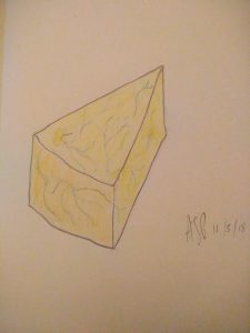
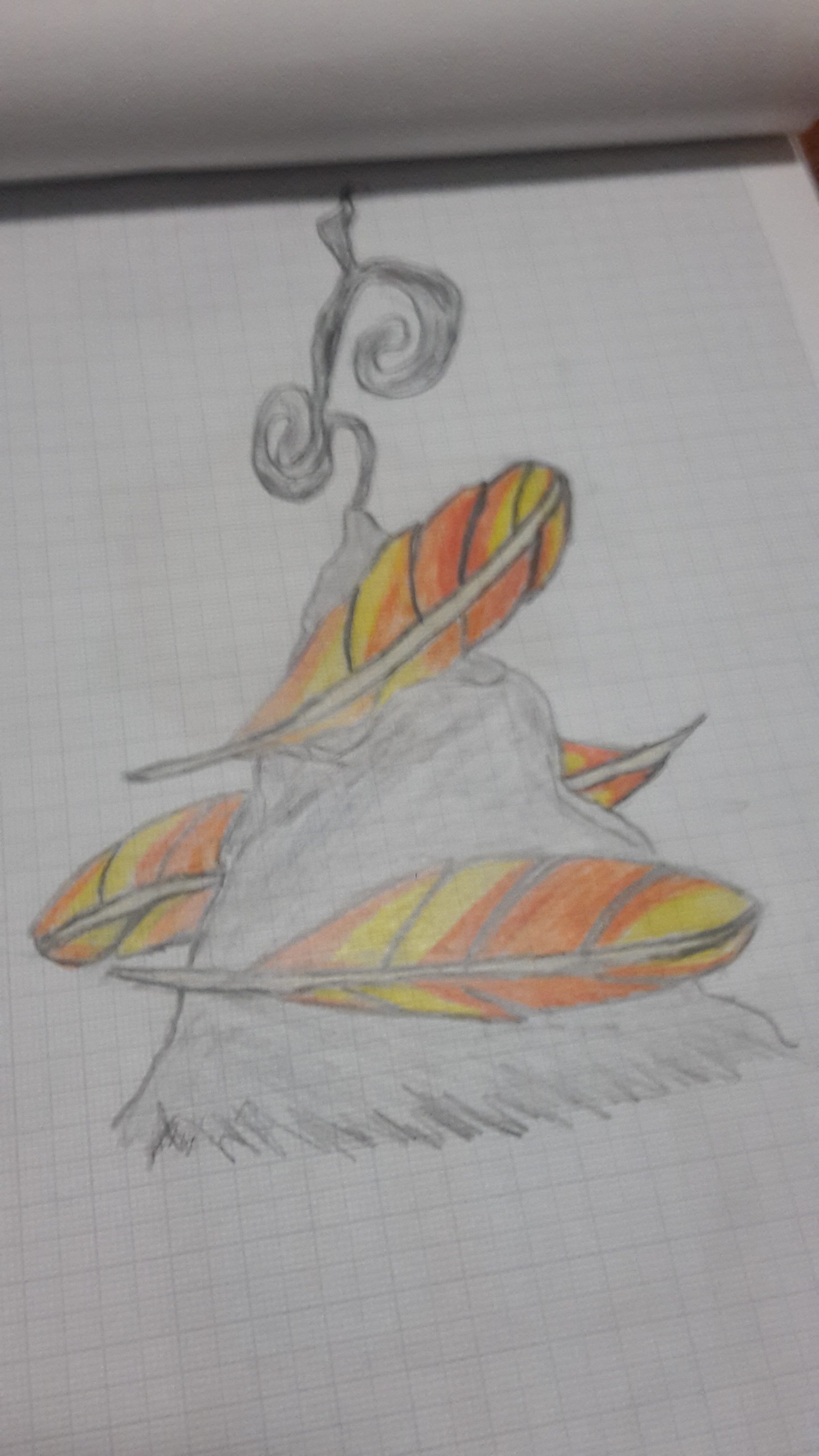
Gustav, by Jenna Fowler

Coloured by Ste Coffey

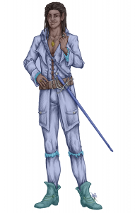
Along with a second colouring (and other minor edits)

Make Do and Modify

In the first post of this month I talked about how to comb the creative commons – finding stuff that fits well enough to the idea you’re working on.

But when you’re trying to be creative, to step into unexplored realms of fantasy, there may not even be that – especially if you don’t have the funds to buy high quality stock art – and even if there is “good enough” never really feels like it’s good enough.

To get the best results from the creative commons – or from novice artists – you need a handle on image editing and adaptation. Transforming an image from what it is to what you wish it was.

For our fantasy works one vital trick has been demodernising – giving modern day photos the appearance of paintings or illustrations that suit a fantasy feel. There are two steps to that: First you must remove any clearly anachronistic elements and then you can put the image through various pre-made filters like GIMPs “oilify”.

Demodernising

Removing the anachronisms can be simple, just cropping out the electricity pylon on the edge of a photo of a village, or it can be more complicated – removing a deck chair from the middle of the courtyard you need to depict.

The most vital tools for me in dealing with the more difficult cases have always been copy-paste and recolouring: a deck-chair against a wall can be overlaid by another portion of the wall, with the blur that will be introduced by oilify or similar tools hiding the minor seams. Meanwhile the green wellies worn by a medieval re-enactor on a muddy field can be turned a deep brown and simply be leather boots within the image.

Using filters like oilify seems like a trivial task – and honestly it can be. But for best use it’s important to think about how real painters work. Unlike a photograph not every portion of a drawing or painting is equal in resolution, but rather they have a level of detail decided by how much the painter, and the audience, care(s) about them – in a portrait the subjects face may be almost photorealistic while the background is merely lumps of colour in the rough form of furniture. As such it helps to separate portions of the image and use the filters more or less strongly on them depending on how important they are to your final composition [and on how many minor errors you need to hide].

(Re)colouring

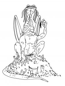
A lot of creative commons stuff is black and white, or coloured inappropriately for what you have in mind. Recolouring is thus an important tool to have in your repertoire as it greatly expands your options – see Gustav at the top for an example.

For colouring monochrome works I rely on layers. A basic tool available to digital editors that makes the process far easier than it would be on paper, layers in an image editing program are pretty much the equivalent of laying transparencies atop one another to make the full image. But they come with some snazzy options that make the whole process a lot smoother. By altering your layers’ transparency settings and order you can use wide swathes and then add detail on top – colour in the whole torso, and then colour in only the belt atop that. More importantly for me you can put the original image on top in a darken-only layer which allows the textures and detail that the original black-and-white artist created to shine through.

I generally use Krita for this as I find its brushes more useful for the process, and everything a little easier to organise, but it is a little slower.

If working with something that’s already in colour I have two options to hand – the first and most prevalent is to use the GIMP colour editing options to alter what each colour on the existing image is. Changing all the reds to purples or making all the blues more vibrant can work wonders. The second is to simply make the piece monochrome and then go from there.


There’s a lot more to say on the subject, and I promise I’ll come back to it in more depth, but for now I need to get prepped for my NaGaDeMon project, a 13th age monster for each day of November. If you have any questions or advice about image editing, be sure to let us know!

Please follow and like us:

Arty October: Ali’s Thoughts

Cheese makes for good adventurer’s rations

Ste wants us all to write about our experiences with visual arts. I’m not so much about what it looks like – my artistic streak has always been music, and writing to me is an extension of sound – I read everything out loud – even in my head, words are vocalised, characters have accents, and locales are narrated. This may be the root of the long-running disagreement between Ste and I about the role of commas. I put them where I breathe, and Ste uses a different set of rules. [I overuse dashes instead – I like commas, but dashes are about 20% cooler. – Ste]

Appropriately,  I’m writing this sat in an art gallery. Well, not quite, but it’s my in-laws place, and that whole branch of the family are artists – sculptors, photographers and painters <See my blog last week – Loz>. Every wall is covered with pictures, every level surface has sculptures and vases and hats and antlers and … stuff. It’s at the same time fascinating and intimidating.

Every kid draws some, and paints some – we’re visual creatures, and part of making sense of the world is to try to reproduce the pictures in our heads. I never really got much beyond the ‘this is my family, and my home; my mum is not actually as tall as my house’. Where I’ve had to draw things – for handouts when teaching – I’ve tended to go with symbols. Things one can construct – 36 pointed stars and other applied geometry. Occasionally, the odd cartoony figure has crept in – this person is thinking, this one is writing, this one is running. But I’ve mostly just broken up text with tables and diagrams, or even clipart.

Everyone who does any kind of visual work at all has just groaned. We love to hate art libraries – whether they were the old 8-bit squares, the MS clipart series or newer online ‘art for your game’ archives. The problem is where they are overused, where we see the same dozen images again and again – and we feel the author is lazy, and we disdain – and of course the legal knot of copyright and fair use.

Recently of course, the standard range of clipart will not do. Ste wrote about usage rights on Google Image searching, and that has sufficed for most of the Setting Shards for which I was lead writer. Most of the art I’ve picked out is from Wikimedia – and there’s enough there for much of what we need, particularly when one applies the Crop tool. Take a look at all the art for Grey Market – most is from larger pieces selectively trimmed to say what we want to say.

We’ve commissioned some art – the Lichen Lich, Valdis the Magic Item Addict, the suit symbols for Concept Cards – but the problem with this is both expense (we wouldn’t take free, because exposure kills artists) and trying to communicate what is needed – one of the reasons for needing art is that sometimes words are not quite enough.

What we really need is one of us to be able to draw the worlds we imagine. To that end, both me and Amy are learning to draw. We’re doing Inktober – drawing something every day for a month, to explore styles and media. I’ve found I prefer working in pencils (you will probably never see the disastrous oil pastels attempts) And I love drawing puns – a Chocolate Moose, and the bandaged monster Mummy and her partner Daddy. Visuals are not my forte, but they are perhaps becoming my pianissimo?

I’m not going to be a professional illustrator any time soon, but it’s an interesting aside to think about how things look on a page. Practising looking at how things are, so we can better imagine how things might be, if only – which is the core of creative writing.

Of course, that also means we now need to write more….

Please follow and like us:

Art and Experience, Life and Death

This hangs above my TV. The top picture is by my mum, Rosie Birtwhistle, and the bottom two are by my dad, David Hensel.

This hangs above my TV. The top picture is by my mum, Rosie Birtwhistle, and the bottom two are by my dad, David Hensel.

Art and Experience, Life and Death

I’ve grown up surrounded by art and creativity. Ali, on seeing the house I grew up in, commented that it was like an art gallery. But almost everything in the walls is by one or other of my parents and to me it feels entirely comfortable and normal to be surrounded by art. Art galleries are some of my favourite places, although i’ve actually not been to one in far too long – I should rectify that!

Everyone in my family is creative. As well as my parents, I write (as you can tell right now!), and of my two older brothers, one is a photographer and the other was a musician.

My brother, Tim Hensel, is an excellent wedding photographer, amongst other things


Sadly the word “was” is very relevant. My brother, Will Hensel, died unexpectedly about a month ago, and my mum, Rosie Birtwhistle (her chosen nom de plume), died of cancer about 6 years ago. Death focuses the mind in unexpected ways. I have spent a long time thinking about art and people and expression and life – the four are inextricably linked. I think it is important to remember people, as Terry Pratchett said “A man is not dead while his name is still spoken”. So I speak their names here. I refuse to let my relationships with these people end in sadness, instead I say we learn from them.


I can hear a lot of my brother Will in this track, which he produced.

Art can instil emotions, or ideas, it can be challenging or comforting, threatening or protective, funny or sad. All this and more. Art allows us see the world in different ways, be it paintings, music, sculpture, dance, or anything else.

And it is this I think we must learn from these wonderful people.

Please follow and like us:

Arty October: Amy’s Art

Drawing is something I’ve done occasionally throughout my life in dribs and drabs. When I was young I used to try drawing animals but they never came out very well.

When I was in my teens is when I did lots of drawing, sadly the majority of that has been lost over the years as both I and my parents have moved since then. I did try drawing fashion for some time but most of the time it was dark or gothic, lots of eyes and gravestones. Eyes are still something I really like to draw as they have a lot of variation but it’s always clear what they are.

I really started back up again mostly because Ste felt that the drawings I made as part of my other hobbies were good and asked me to try focusing on the drawing itself, so it has been turned it into one of my regular hobbies.

I have several creative hobbies – I’m very crafty and I usually like to have my hands do something as I watch tv or listen to audio-books [which my dyslexia makes much more common, as many fascinating books are unfortunately beyond my capacity to read].

Recently I’ve been doing knitting and crochet,  just starting do these last year and I’ve already made 3 scarfs and a few stuffed toys – as well as a few toys for our pet cat.

Colouring books are another hobby I’ve been practising for a while – I tend to use lots of colours, putting some of my own personality into the final product even if the line art is already fixed. I find it few relaxing but just like drawing I don’t really do it in front of the tv because I like to concentrate on it a bit more. I can still listen to a book, but anything that would take up my eyes would distract too much.

And lastly there’s cross-stitch I started doing when I was 8. I did stop briefly in my teens, but I picked it back up again as I got older and I’ve done so many over the years some big, some small, some easy, some hard. I usually have one or two kits going at any one time and do a few small ones too – for Christmas I try to make sure that those I care about get one as a card or tree decoration.

Cross-stitch is what got me drawing again – I started designing my own now and again, working on squared paper to create the pattern; I did one for my grandma on top as a gift. I figured out how to do ones of monsters because it seemed cool, and it’s something I never see so I thought they might be useful for the business – possibly for sale at conventions.

I usually draw on squared paper as I find it easier to get started on than a blank page – and it helps me work out shapes and keep things neat which I feel helps things look good, since I like them to be neat I do use a ruler, compass and things like that. Since it’s on squares it can look a bit pixelated. and cross-stitch patterns usually do too, the most simple ones are and simple is generally the best place to start. But the pixelation I have grown passed with practice both with my cross-stitch and drawing and other thing that help with this size and shape – if something’s big it usually looks less pixelated and the same with putting curves in, which can be done in cross stitch through haft stitch and back stitch allowing different angles of diagonal.

So for my drawing i ten to start out on squared paper with a H2 pencil because it’s easy to rub out, then I go over it with a dark pencil and colour – this sometimes gets mixed again once I like what I’ve done, I go over it with transfer paper since there no way that we found to get rid of squares on the PC without losing lots of detail from the image.

Please follow and like us:

Arty October: Combing the Commons

A CC-BY-SA piece by SarahDarkMagic


Much like NaNoWriMo (or NaGaDeMon) in November, October has its own creative challenge: Inktober. While we’re not doing Inktober per se – none of us are inking any artwork – we decided that a good theme for this month’s blogs would be to look at how we can do art – in a group that was founded with zero artists.

The longest-standing technique we have is simply buying the art from cheap artists on Fiverr, or stock art from DriveThruRPG and Patreon. But that’s not something that really merits much discussion, so I’m going to skip straight to type two:

Creative Commons and Public Domain Artwork

There is a huge community of artists in the world, as there has been for several millenia, and even with the modern day extension of copyright to frankly ludicrous extremes many of them choose to contribute to the world’s supply of Free Use Art through either simply releasing their art to the public domain, or tying it into a Creative Commons License which allows for great (but not complete) freedom in how their work is used.

Doing your due diligence

Search engines such as Google (with the usage rights tool correctly set) and CC Search make it easy to find people claiming that the works they’re sharing are publicly usable, and if you’re planning on doing something purely non-profit that’s probably good enough – but if, as we are, you’re working on a commercial basis you’re going to need more confirmation than that, because a lot of people mislabel images, generally out of ignorance.

For instance, this image from the above search is not creative commons licensable in many countries – the models that were photographed are themselves copyrighted, and it’s likely not to count as a sufficiently transformative work to escape that copyright. Certainly if you were to crop it down to a single unpainted model you’d be in trouble in much of the world.

Another common form of not-actually-usable work is screenshots from computer games – as the game is copyrighted an image from the game is almost certainly covered by the same copyright. So your first check with digital art should always be to see whether or not the work mentions such a source.

One of the best places to find art that you can be certain of is Wikimedia. While anyone can contribute to that site, and thus newly submitted works are suspect, there is a large team of dedicated curators who do due diligence on everything submitted, meaning that you can avoid spending too much time checking over things yourself.

Another good site for finding such things is OpenGameArt.org their due diligence standards are a little laxer than Wikimedia’s, so it’s still a good idea to check things out for yourself, but there’s a lot of fantasy art on there.

To confirm that art is actually open for use first look at it closely – if it has an artists signature which doesn’t match the accreditation on the site you found it on you can be pretty sure it’s not. If that doesn’t rule it out the second step is a reverse image search – find it elsewhere on the internet, and see whether there’s an older source that indicates a different owner.

Track your sources

Once you’ve done your due diligence making sure you can actually use the piece you need to make sure you don’t lose track of your proof. We keep a set of spreadsheets that list the filename of each piece alongside the creator, the web address of the source and the specific license used (including any special terms).


Anyone else have any advice to give about combing the commons? Favourite sources?

Please follow and like us: